Visual Capitalist
Capturing Attention in a Data-Heavy World
STUDIO
Visual Capitalist
ROLE
Data Visualization, Design Strategy, Branding
TOOLS
Flourish, Illustrator, Photoshop
STRATEGY & ACCOUNTS
Katie Jones, Chris Dickert, Juan Carlos Cevada, Mack Cameron, Georgie Hackett
DESIGN TEAM
Athul Alexander, Zack Aboulazm, Abha Patil, Jen West
EDITORIAL TEAM
Ryan Bellefontaine, Cody Good, Alan Kennedy, Jenna Ross, Julia Wendling
The 2-Second Rule
In today’s attention-starved digital landscape, you have seconds, not minutes, to communicate a takeaway.
When I first started working at Visual Capitalist, one of the first things I was told stuck with me most: “We design bite-sized data visualizations for skim-readers."
We were working with a high-stakes audience: investors, founders, busy professionals scrolling between meetings. People who don’t have time, and honestly didn't owe us their attention.
At Visual Capitalist, the challenge was never access to the data. It was getting people to care enough to stop scrolling.
If the main takeaway couldn’t be understood in the first 2 seconds, the work didn’t matter. A chart that required explanation had already lost the audience.
That single idea reframed how I approached design.

We weren’t making charts, we were telling stories.
My role sat at the intersection of strategy and execution, and the real work always happened behind the scenes. The job was to uncover the story buried within the data, the one insight strong enough to make people stick around.
Over time, this philosophy evolved into a clear but repeatable approach that I carry forward into my design practice today.
The Best Insights Come from Collaboration
At Visual Capitalist, designers, writers, and editors always worked closely from the start. Writers challenged visuals, designers challenged copy. Everyone asked uncomfortable but necessary questions, and the best insights often came from conversation and iteration.
Design Around the "Why"
Anything that distracted from the main takeaway was stripped away. Hierarchy became one of the most powerful tools: scale, contrast, color, and spacing were used intentionally to guide attention straight to the “why.”
Make the Insight Memorable
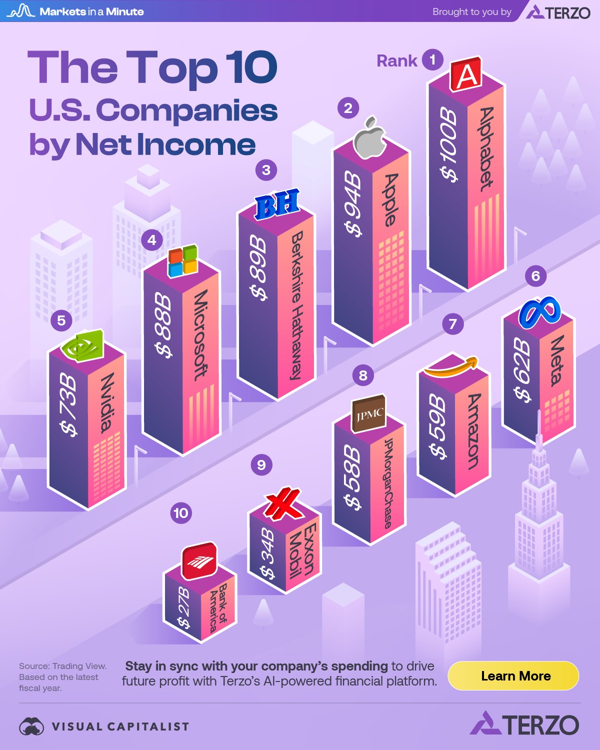
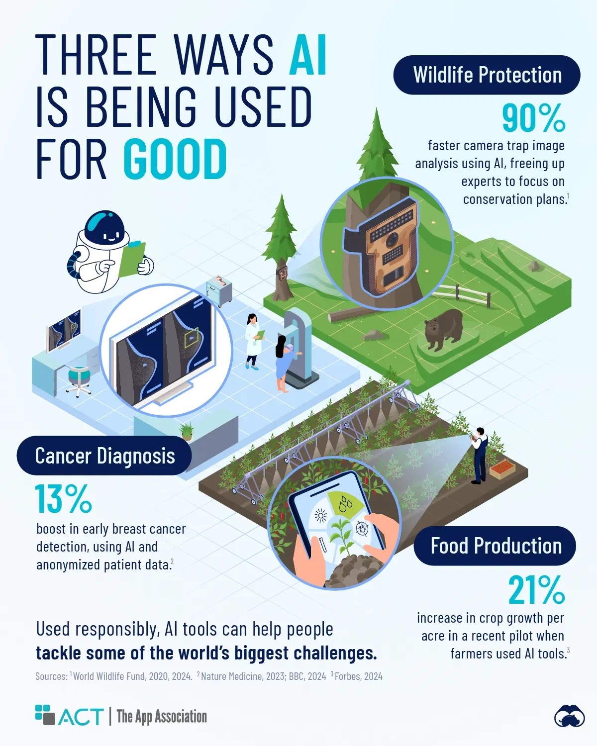
To stop the scroll, the data had to resonate on a personal level. We leaned on visual metaphor and relatable imagery to make the data feel human. Numbers became skyscrapers, landscapes, or physical objects. Market crashes turned into falling houses of cards. Wildfire trends became trees in flames. By grounding abstract metrics in everyday experiences, the work moved beyond information and into impact.


When attention is scarce, clarity becomes the most powerful design decision you can make.
Work that cuts through the noise begins with clarity of purpose. The strongest designs stop the scroll by clearly communicating why they exist. When meaning leads the message, design earns trust, builds connection, and turns design into a driver of lasting impact.

